How to really cope with varying screen sizes and pixel resolutions in Vodafone Widgets
The sizing of text and graphical elements on different displays is a fairly complex problem in Web development. It is different to what you simulate when you drag your browser window to different sizes – because it is more about the pixel’s physical size. A working solution to this is built into the Vodafone Widget Manager and it’s only based on standards: CSS, CSS Media Queries and JavaScript.
Pixel-Density
Displays have two obvious characteristics: The sheer physical size and the number of pixels they are made of, often called “resolution”. However these two are actually combined into a third attribute, called the pixel-density. This is often measured in pixels per inch (ppi) and it specifies how many pixels fit onto one inch of screen width or screen height, assuming that pixels are square which they mostly are.
Typical displays
While printed magazine pages can reach up to 600 ppi, most computer displays are today within a range of 90 to 150 ppi. Mobile phone displays can go up to 330 ppi, but can also be as low as 130 ppi. It is to be expected that these numbers will continue to increase slightly in the future, but there is a maximum value that will probably not be exceeded. This value is given by the distance that you hold a display away from you and by how sharp your eyes can see. This means that pixel-density will not keep growing in the same way as memory or processor performance do.
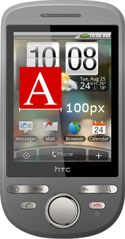
| HTC Tattoo | iPhone 4 |
|---|---|
 |
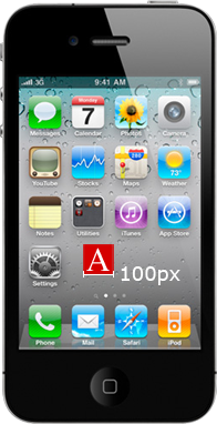 |
| 320 x 240 | 960 x 640 |
| 2.8 inch | 3.5 inch |
| 143 ppi | 330 ppi |
Web content
First of all, the CSS specification defines the px unit as a relative one – relative to the output device. A user agent may decide to render one “CSS pixel” as 4 pixels if this makes sense, for example because of a high pixel-density. You can try a similar effect when you zoom in to a page in your Web-browser. Fonts are rendered larger and bitmap images are no longer rendered pixel-perfect, but get blurry or rough, depending on your OS.
For Vodafone Widgets, this strategy is perhaps the easiest part of the scaling concept. If your Widget has been developed in a fixed size and is too small for a S60 5th edition display (typically 640×360 at about 3.2 inch diagonal, meaning 230 ppi), it will be zoomed so that it fills the screen. This gives results that are usable. Unfortunately zooming is not available on all platforms, and you can make things look much better and make real use of the high resolution displays with the following strategies:
Use of relative units
There are units in CSS that are considered relative to other values, for example em. 1em is equal to the font-size of the element on which the unit is used. If you always use em, you will have one value that can be tweaked to adapt to higher resolutions – and that is the font-size of the body element. All your em values inherit from this value.
Switch via Media Queries
There is a ‘resolution’ keyword for Media Queries, that is supported in Vodafone Widget runtimes. It lets you define CSS rules that only apply on a given ppi value. This means you redefine the font-size of the body element, and everything still looks great in a higher-resolution environment. In CSS you have to use the unit dpi instead of ppi, because in CSS pixels are always meant relatively, as explained above. A template similar to the following one is included in the Widget Packager tool that is part of the Vodafone Widget SDK.
body {
  background-color: #FFF;
  font-size: 12px;
}

@media all and (min-resolution: 150dpi) {
  body {
    font-size: 15px;
  }
}

@media all and (min-resolution: 200dpi) {
  body {
    font-size: 20px;
  }
}

@media all and (min-resolution: 250dpi) {
  body {
    font-size: 25px;
  }
}

@media all and (min-resolution: 300dpi) {
  body {
    font-size: 30px;
  }
}
However this still leaves the bitmap images unchanged, because if you size them in em, they will get blurry because they will be scaled on the client side. It’s still better to size them in px, just using the size the actual pixel image is in. This way they will appear smaller on a high-res display, but they will still be rendered in a high quality and not scaled up.
Use different resources for higher resolutions
With the power of the ‘resolution’ Media Query you could also swap images and use them in a higher resolution, but that only works if they are set in CSS (as content, background, border-image or list-image). If your image is the src of an img tag, you can swap it through JavaScript, but you have to do a little trick to find out what the ppi value is, because there is no direct interface to Media Queries from JavaScript.
function getPPI(){
  // create an empty element
  var div = document.createElement("div");
  // give it an absolute size of one inch
  div.style.width="1in";
  // append it to the body
  var body = document.getElementsByTagName("body")[0];
  body.appendChild(div);
  // read the computed width
  var ppi = document.defaultView.getComputedStyle(div, null).getPropertyValue('width');
  // remove it again
  body.removeChild(div);
  // and return the value
  return parseFloat(ppi);
}
The fixed size use-case: Use of absolute units
There is a third aspect to the scaling solution in Vodafone Widgets. In most browsers, a value of 1cm in CSS would be interpreted as 37.8px, because the OS tells the browser it’s running on 96 ppi, and it will be converted to pixels, according to this. But because the Widget runtime is aware of the pixel-density, the value can be calculated by taking the actual pixel density into account. This enables you to show a picture of something in its real size, for example a wristwatch, a ring, or a phone.
Also it would let you define font-size in an absolute unit like 9pt, which is very interesting. However I still recommend the Media Query solution, because it keeps you in full control of what is going to be rendered. It enables you to test how your layout will react in different resolutions, just by commenting out the conditions. Also it can make sense to make fonts slightly smaller, the more ppi a display has, because the extra pixels a font is rendered with make it more clear to read. Users are often used to seeing more content that makes use of their sharp screens.
The outer size of the Widget
One thing that shouldn’t be forgotten, is to also make the outer size of your Widget adapt to the available space on the display. The widget element in your config.xml has a width and a height attribute. One solution to make your widget display in fullscreen is to set huge values for both attributes. The disadvantage is that this won’t let you use the same widget on a desktop, where you will want to display the widget smaller.
The best recommendation here is to use a value that works on the desktop, and use a few lines of JavaScript to maximize on a mobile device. Deciding if you are mobile or not can only be done based on the widgetMode the widget is running in. The following code is also included in the templates inside the Widget Packager tool.
// check to scale the widget to full-screen
function checkFullscreen() {
  // only scale when there is a lowercase widget object, and when it's
  // safe to say we're running on mobile, widget-mode will be "widget"
  // on desktop
  if (window.widget && widget.widgetMode === "application") {
    window.resizeTo(screen.availWidth, screen.availHeight);
  }
}

// react on widget resolution/orientation changes
if(window.widget) {
  widget.addEventListener("resolution", function () {
    checkFullscreen();
  }, false );

  // do it now, as part of the startup process
  checkFullscreen();
}
Future Outlook
The solution presented here is maybe not the easiest one, but it demonstrates how Web content can really leverage high-resolution displays. With the work of the W3C, it is certain that there will be changes to the viewing concepts and modes. Please see the view-mode spec for further reference. Outside of the widget world, concepts about pixel-density are also moving quickly, and there are several competing ones. The viewport meta tag is what is relied on mostly, though it cannot replace the exact ppi that are available to the website author. The Vodafone Widget Manager solution is a proven solution that works with all of the mentioned use-cases, Widgets work across three platforms and numerous devices with alternating pixel-density.
Daniel Herzog (twitter.com/danfooo), Vodafone Group Services


 mobilewidgetdev.wordpress.com
Nice article, this is the very basis from where to start, expecially for who’s entering for the first time into the cross-platform widget developing.
Another thing that would be really appreciated, it’s some update status from you about Vodafone design patterns,the work in progress,the documentation in general.
I strongly believe that a standard look and feel from which to build Widget can encorauge much more in cross-platform developing, and give a stronger identity to “Vodafone Widgets”, helping people to associate easily the concept of a Widget not like few lines of Html,Css and javascript put all together, but a wide vision of technologies mixed together
which allow to produce not “simple programs” but complex ones, concept that people have of “Apps” for iphone.
Sorry if i wrote a bit much, i just wanted to drop some lines 🙂
Best regards
Carmelo Maiolino
This is a great post Daniel, thank you!
There is one thing that I don’t think will work for the latest JIL 1.2.x platform. The section called “The outer size of the Widget” shows sample code that is for the JIL 1.0.x spec. The lower case widget no longer exists, nor does the addEventListner method. Finally the “resolution” event has also been deprecated.
Everything else, however is great. Thanks, I think this will be a great help to developers.
Best regards,
Dan Silivestru.
Hey Dan,
thank you, you are right. The best way to stay compatible is to only do the scaling when the lowercase widget object exists, I will modify the post accordingly. It also makes sense because it makes testing your code in a browser easier, widget specific code will just be skipped.
BR,
Daniel